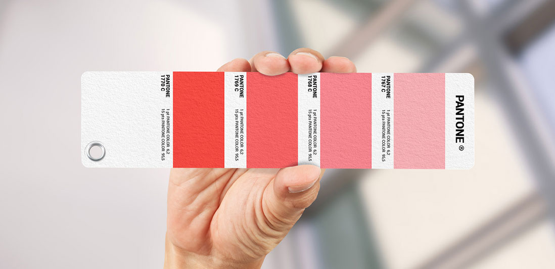
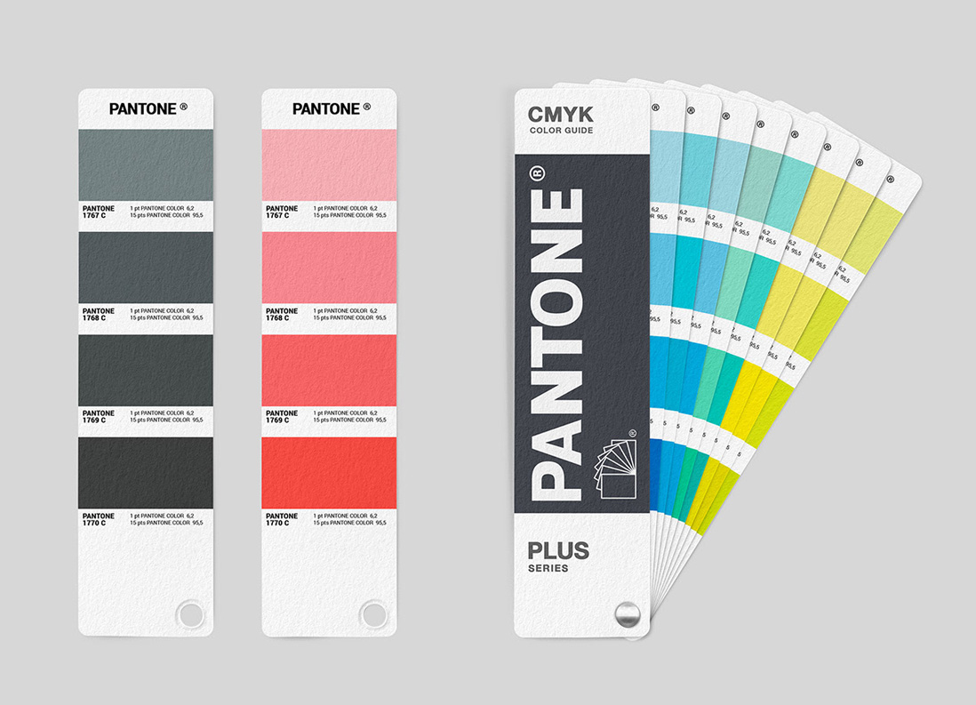
Pantone is a limited liability company headquartered in Karlstat, New Jersey; Most people who work in graphic design, fashion, decoration, etc. know more about this company.
It is interesting to know that this company determines the "color of the year" and many people know it for this reason! But Pantone's main popularity is related to the introduction of the Pantone Color Matching System (PMS), known as the "standard color space."
Many people every year think that choosing the color of the year is a matter of public taste and the general choice of the people is a priority! But it should be noted that in determining the color of each year, a large and expert group in several meetings come to a common choice, which is eventually known as the color of the new year.
What is the color history of Pantone?
What is known today about Pantone is in stark contrast to what it was in the past. Pantone first started in 1950 as a "publishing" company under the brand name (M & J Levine Advertising).

It is interesting to know that this color system is derived from Mendeleev's table in which each color has its own number; This idea made it possible to confuse colors, especially among fashion designers. Herbert, with his knowledge of chemistry, worked in the printing unit for six years and made a significant profit; This was at a time when other divisions of M&J were raising significant debt!
This prompted Herbert to enter into negotiations with the company's founders and offer them a $ 50,000 debt settlement; Levine Advertising was bought by Herbert for $ 50,000.
The new founder of the company came up with pure ideas and this changed the name of the company to Pantone (all colors); Such factors led the company, which in the early 1960s only to produce color cards for several cosmetics companies, to change course and in 1963 produce the first color matching system.
Pantone introduced the color of the year issue in 2000, and it is interesting to note that it was very well received by designers; This issue caused this issue to continue and the color of the year is chosen at a specific time each year!
Such issues gave Lawrence Herbert considerable prestige and increased the scope of its activity in the field of production of colored goods; However, one of the significant developments of this company is the International Color Authority ICA color standardization system.
But it did not end there! About four decades after Pantone became famous, X-Wright (a color measuring software tool company) bought Pantone for $ 180 million, and in 2012, Pantone was sold to Danaher for the third time.
What color is Pantone?
In answer to the above question, it is necessary to know that Pantone color is not specific to a specific color and is in fact a set of colors that the company has provided to reduce possible errors and ease.
As mentioned earlier, Pantone's main success is their color matching system, known as PMS for short.
In fact, this is related to 1963, when Herbert realized that the final output of printed colors is different from the color displayed in software (RGB)! This prompted Herbert to introduce the Pantone PMS adaptation system and solve this problem.
Before the introduction of this system, if the customer orders the design of the logo or any other work sample with a specific color to two different companies; The result of the design color of the two companies was different from each other! But today, thanks to the Pantone color matching system, the probability of such errors occurring is almost zero!

Pantone's other activities
Today, Pantone helps many companies choose colors; In fact, many activists in the field of packaging design, fashion, decoration, graphics and مشاور use the advice of this company! This has enabled companies to use these colors based on their type of work and strategy.
Other activities of Pantone, as mentioned earlier, include determining the color of the year; With the help of color psychology knowledge, Pantone is able to choose organizational colors for different businesses. The company's experts also introduce a specific color palette for each season in relation to cultural, political, social and other conditions and make it available to the public.
Other activities of Pantone, as mentioned earlier, include determining the color of the year; With the help of color psychology knowledge, Pantone is able to choose organizational colors for different businesses. The company's experts also introduce a specific color palette for each season in relation to cultural, political, social and other conditions and make it available to the public.
Today, a large part of the company's popularity is related to the unveiling of the color of the year, which has been held almost every year since 2000. During the year color determination, Pantone holds confidential meetings with color standardization representatives (worldwide) twice a year.
The determination of the color of the year is held every year in May (November and November) in one of the centers of European countries, whose meetings have their own rules; For example, it is interesting to know: the venue of the meeting is all white so that the delegates do not get any idea of the color of the environment!
As mentioned earlier, Pantone considers many factors in choosing the color of the year, such as political, social, economic, and other issues, and its only effort is to raise the morale of the world's public through colors, among which great designers They follow this rule.
Pantone is now run by Ms. Leatris Eismann (CEO), a person who has a great deal of influence in determining the color of the year; Every year, after selecting and determining the color of the year, Ms. Leatris Eisman provides a brief explanation of the selection and the reason for it to the public.


